Goodbery

Minimalist coffee can design in hand – black and white packaging with bold typography

project overview

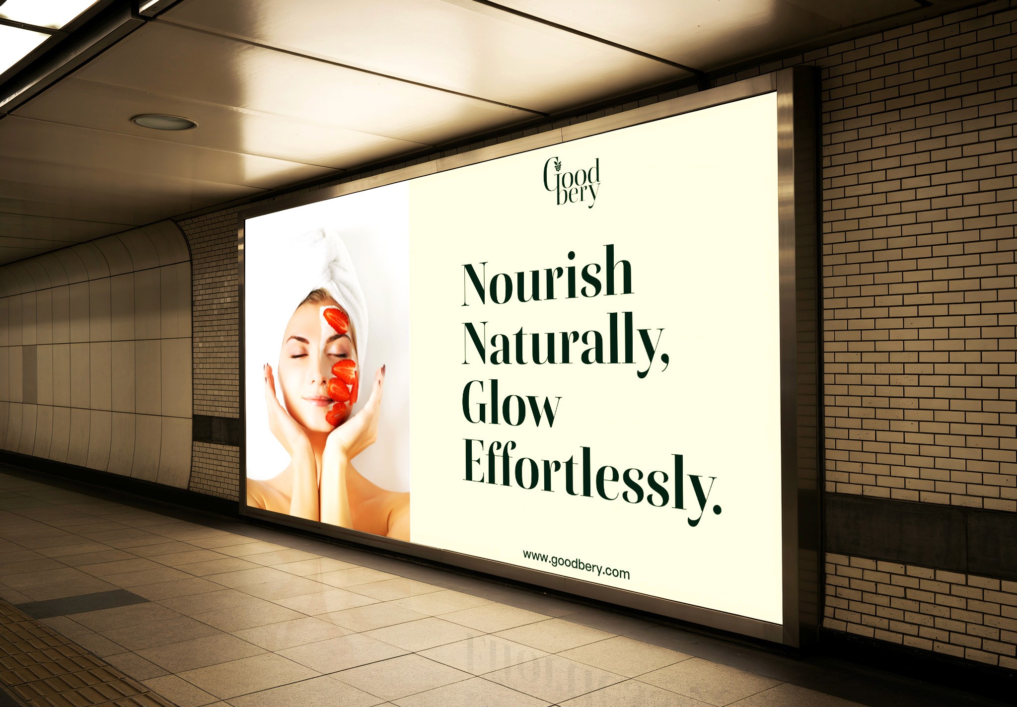
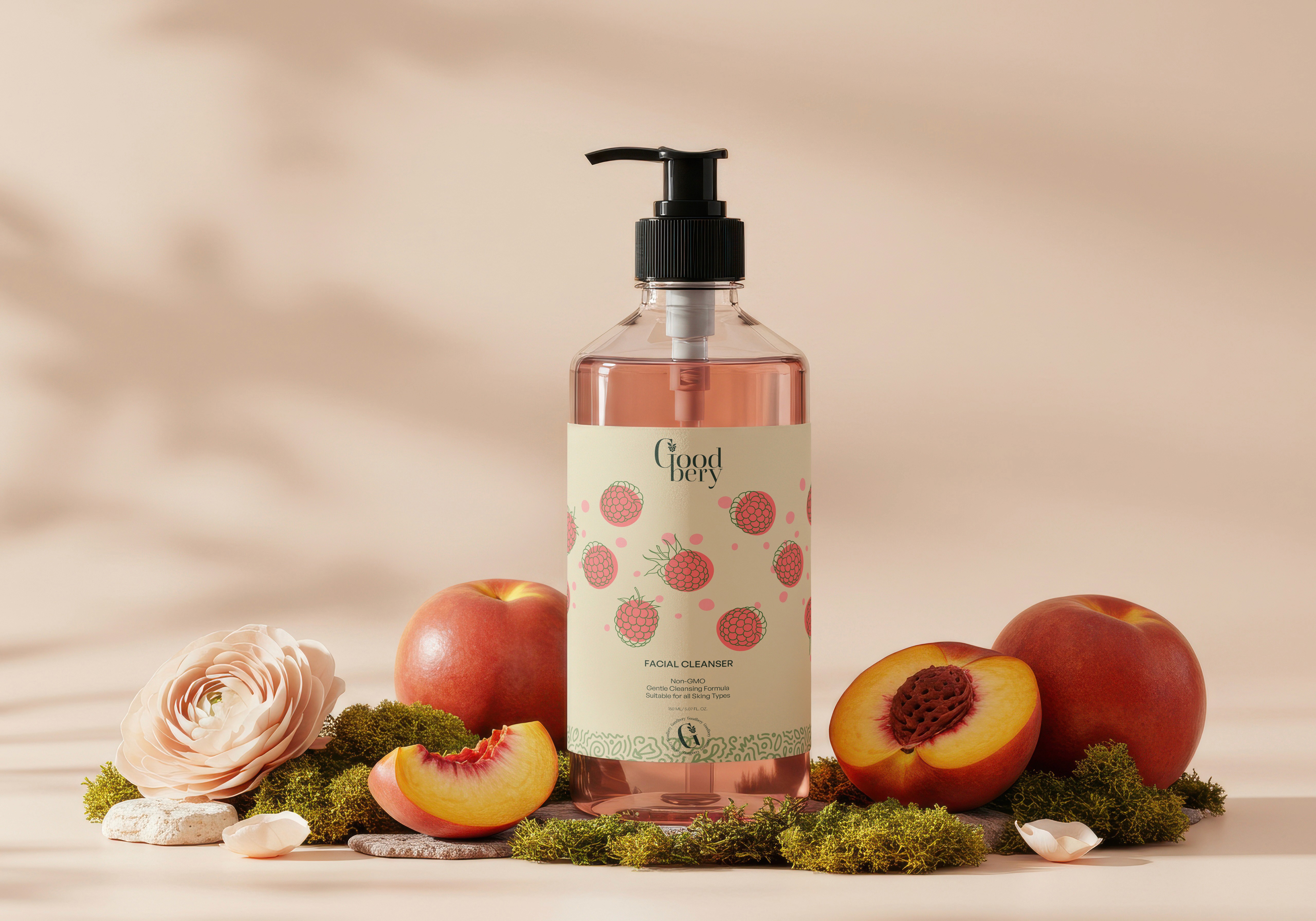
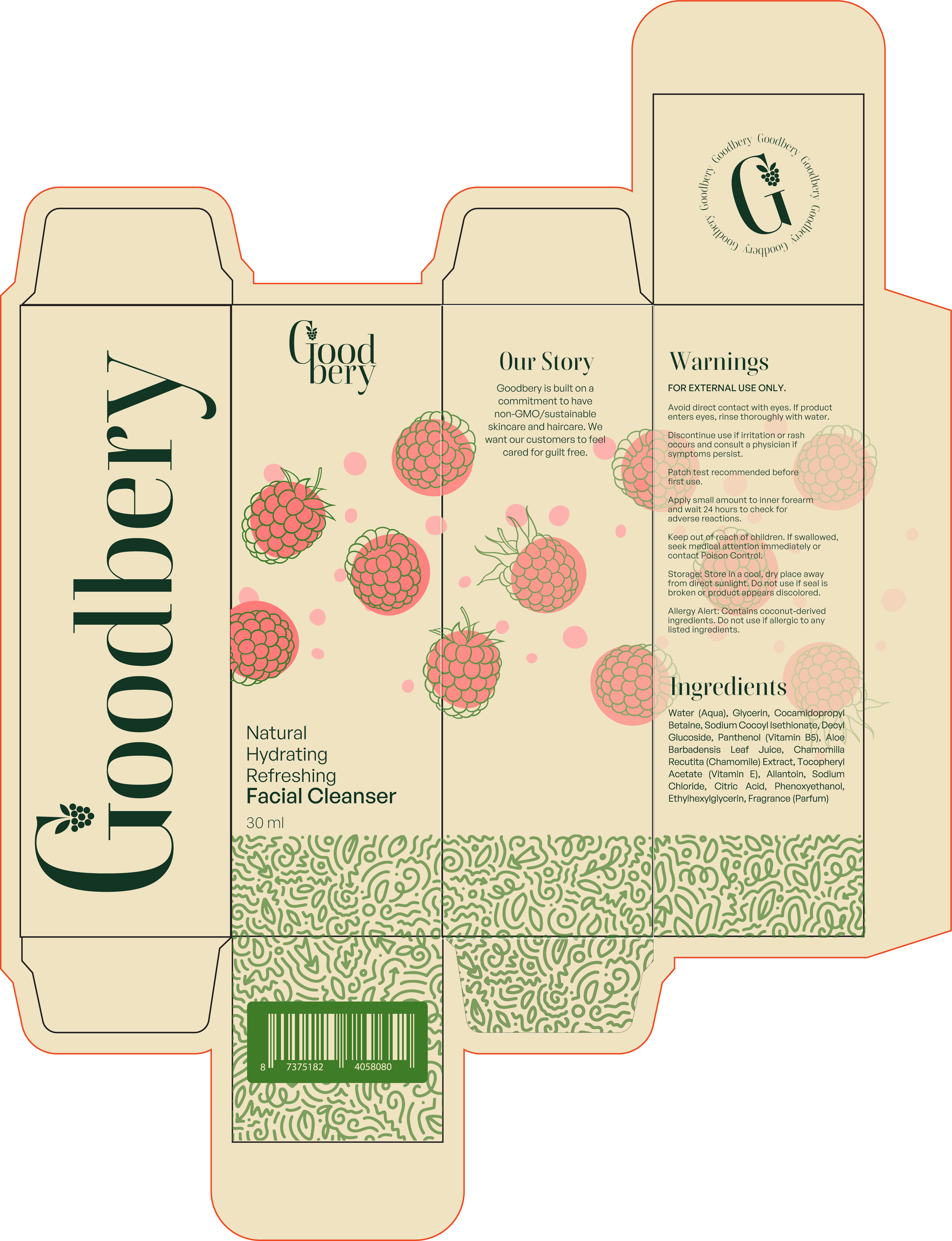
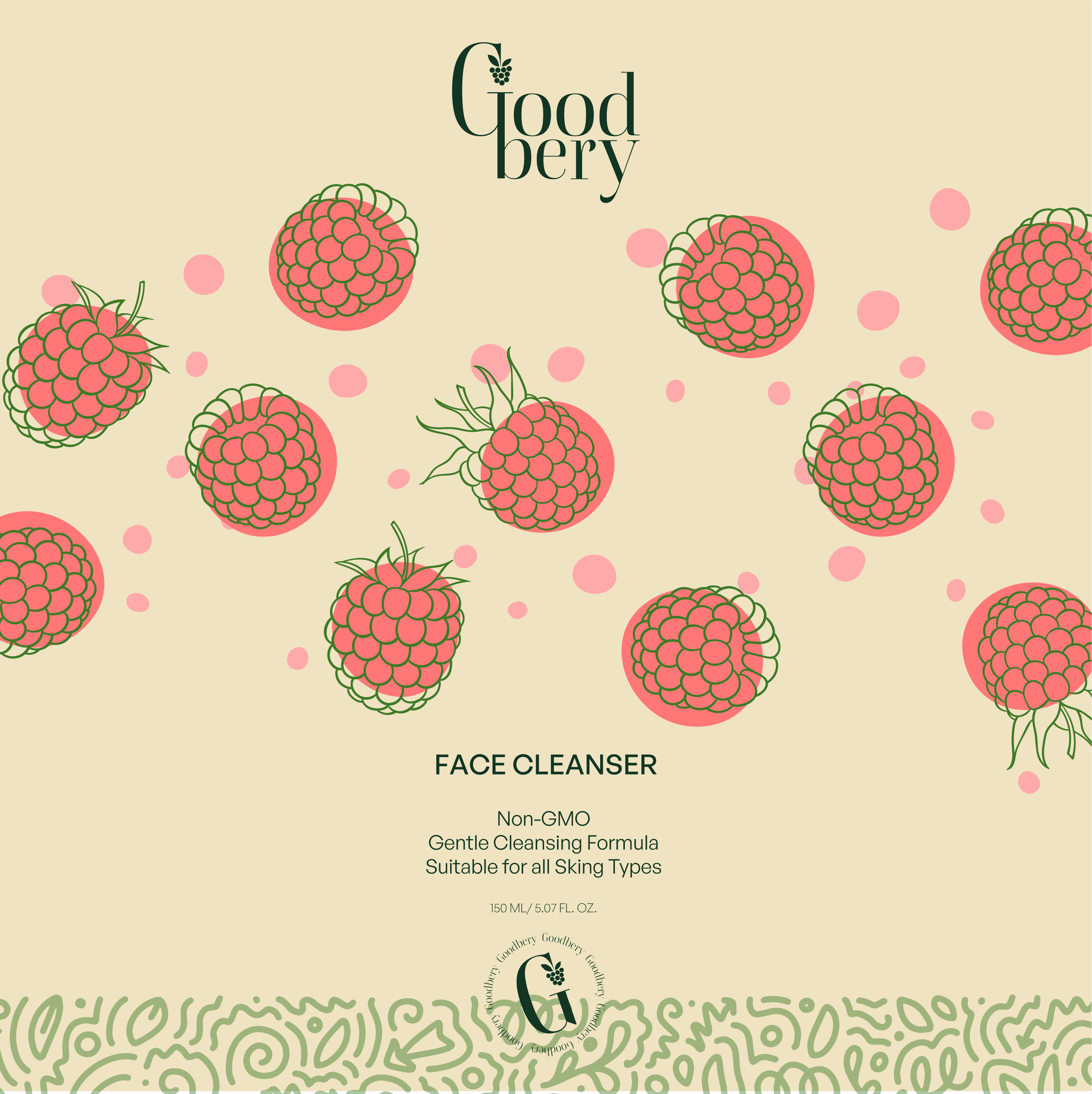
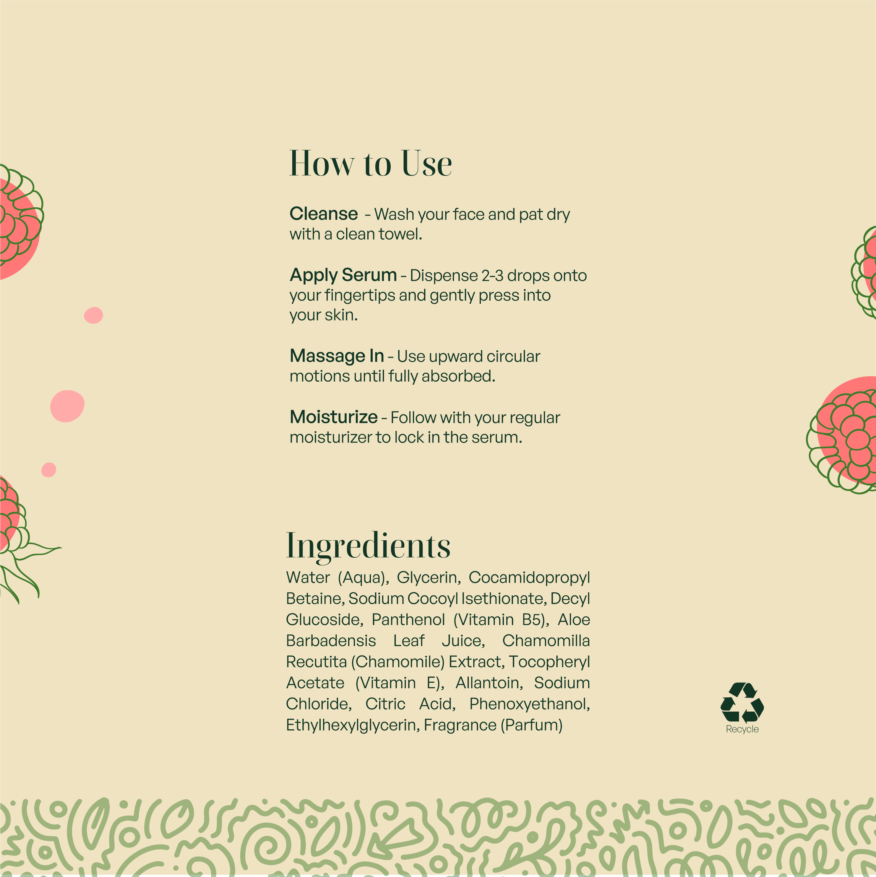
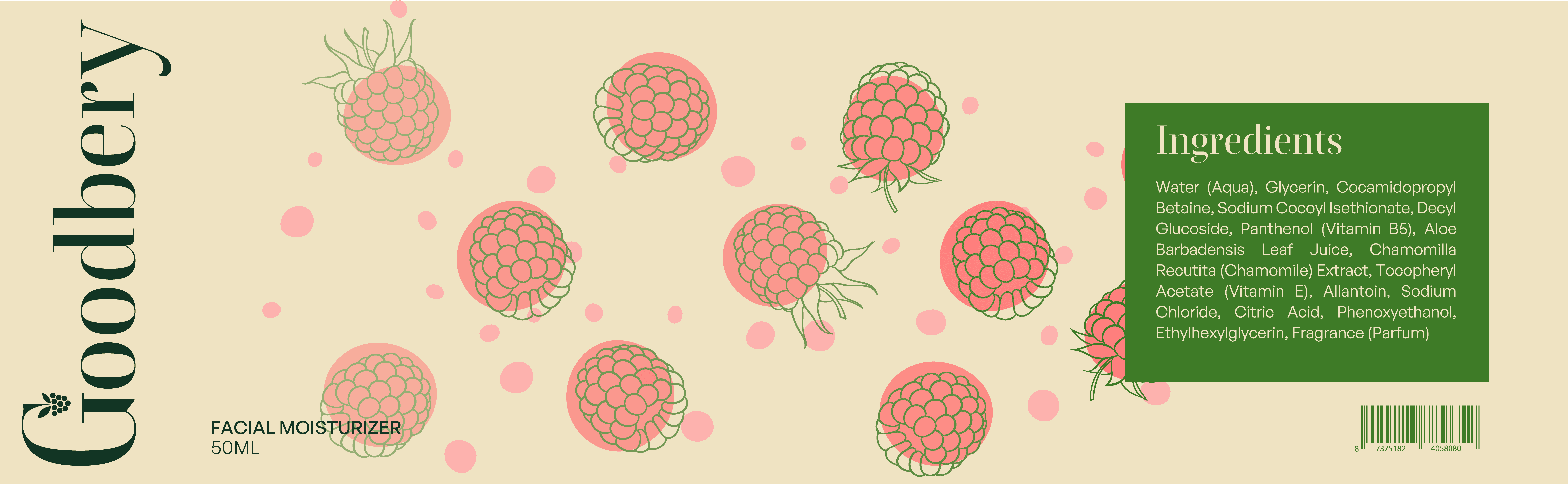
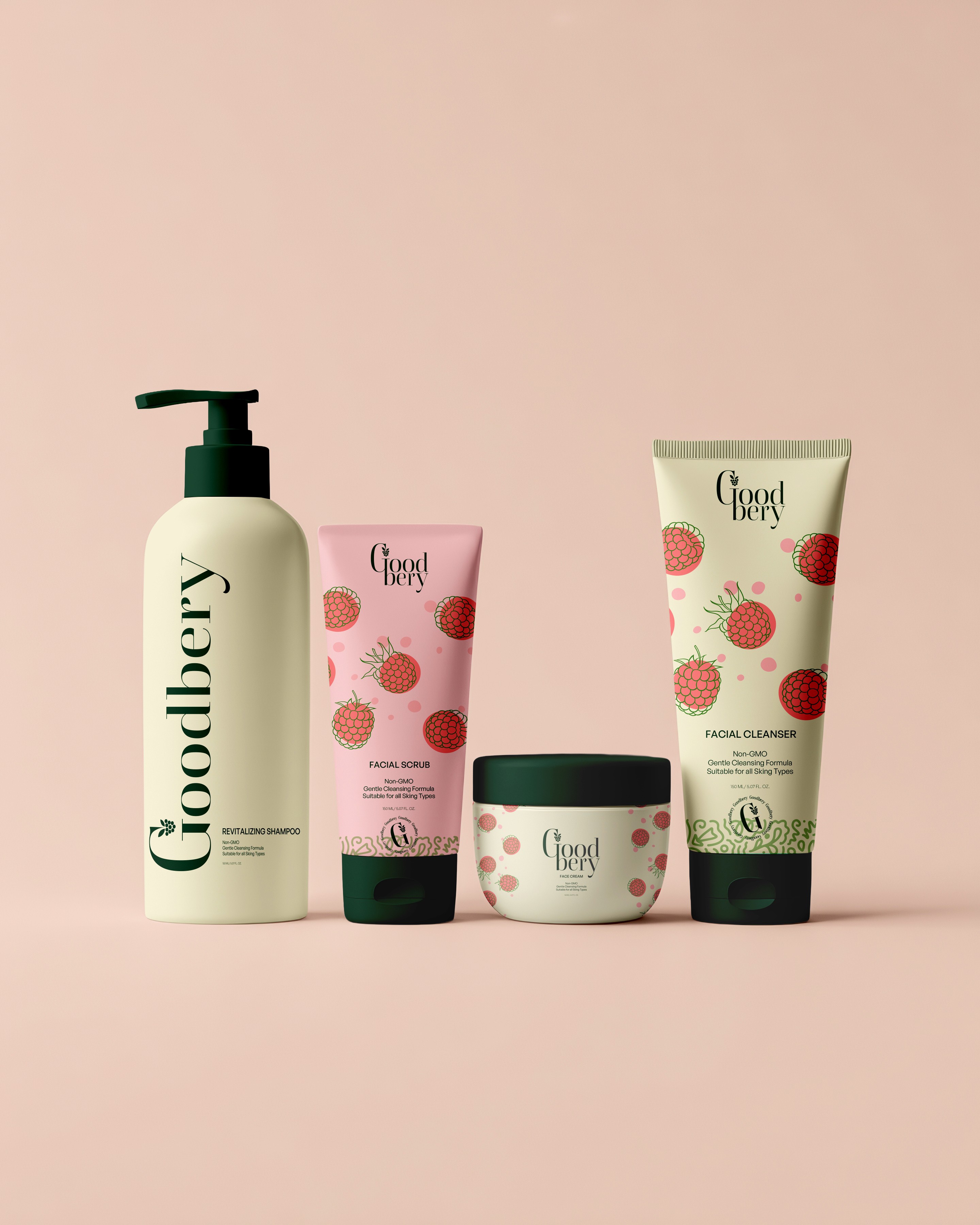
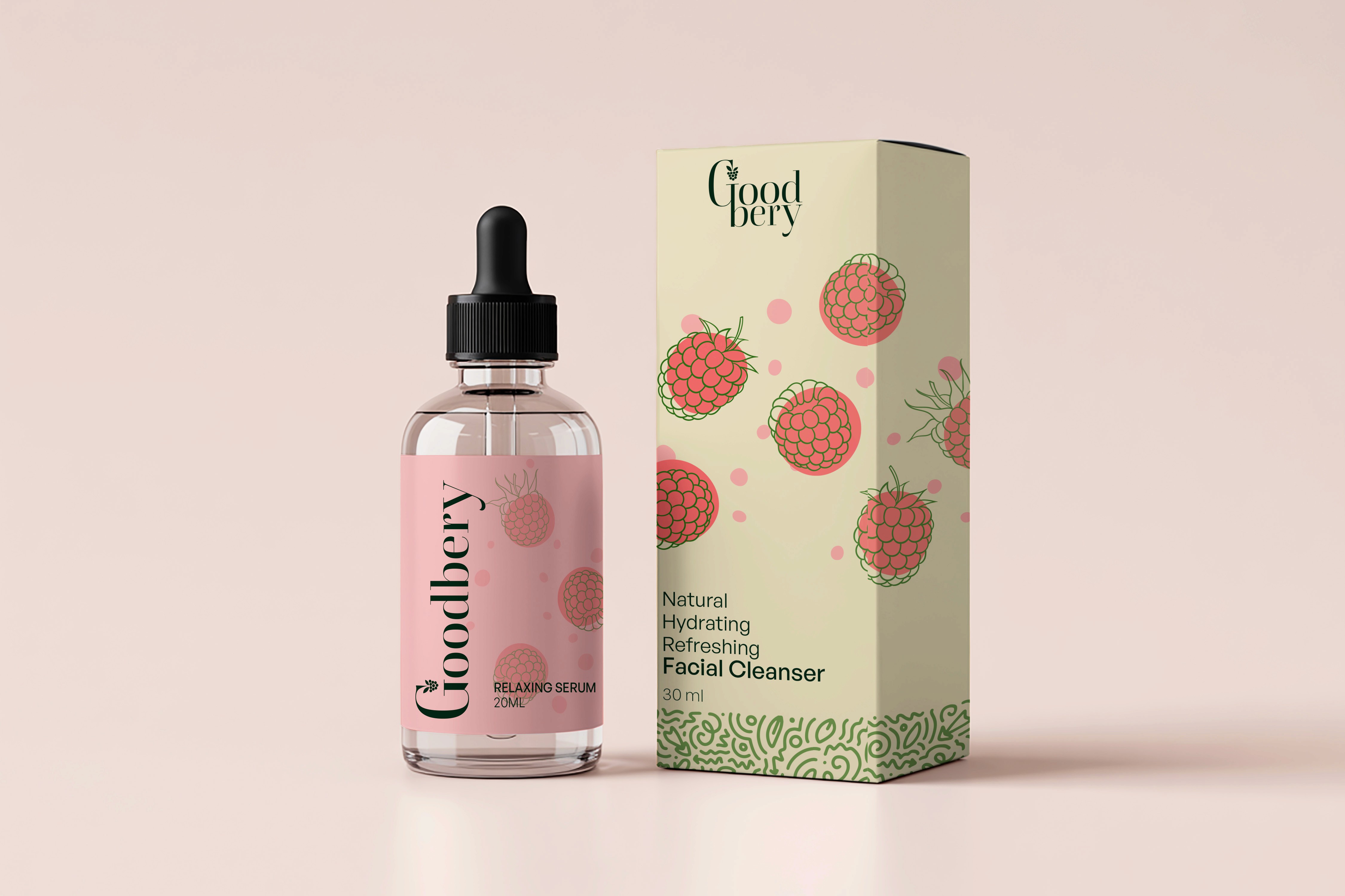
Goodbery is a conceptual packaging design exploring how natural beauty brands can communicate purity and transparency through visual design. This self-initiated project developed a complete packaging system—from product containers to label design—that balances organic aesthetics with modern, clean presentation.

project type

Packaging Design

year

2025

my role

Lead Brand Designer

client

Goodbery

Drink can mockup showcasing modern black and white coffee packaging design

Problems identified:

Examining the clean beauty niche revealed a problem for consumers. They're stuck navigating two extremes: sterile, clinical packaging that feels impersonal, or overly decorative designs that prioritize aesthetics over substance. This observation shaped my approach to the project:

  • Consumer confusion about ingredient transparency and "greenwashing"

  • Difficulty finding brands that balance quality with accessibility

  • Visual identities that either feel too cold (clinical) or too cluttered (decorative)

  • Lack of warmth and approachability in natural beauty packaging


Early Exploration

Research into the naturally sourced beauty market revealed diverse visual approaches competing for eco-conscious consumers. After analyzing competing brands, I chose to emphasize clean layouts with honest ingredient communication, warm natural palettes, and simple yet elegant typography. This direction solved the core challenge by:

  • Balancing credibility with warmth—professional enough to compete while maintaining natural beauty appeal

  • Making transparency a design feature—turning ingredient lists into trust-building moments

  • Creating approachability without sacrificing quality perception

  • Providing scalability across product lines without losing recognition

  • Differentiating from market extremes through refreshingly honest design

Vertical coffee can mockup with clean monochrome label design
Top view of coffee can mockup with bold black typography on white background

Final Concept & Rationale

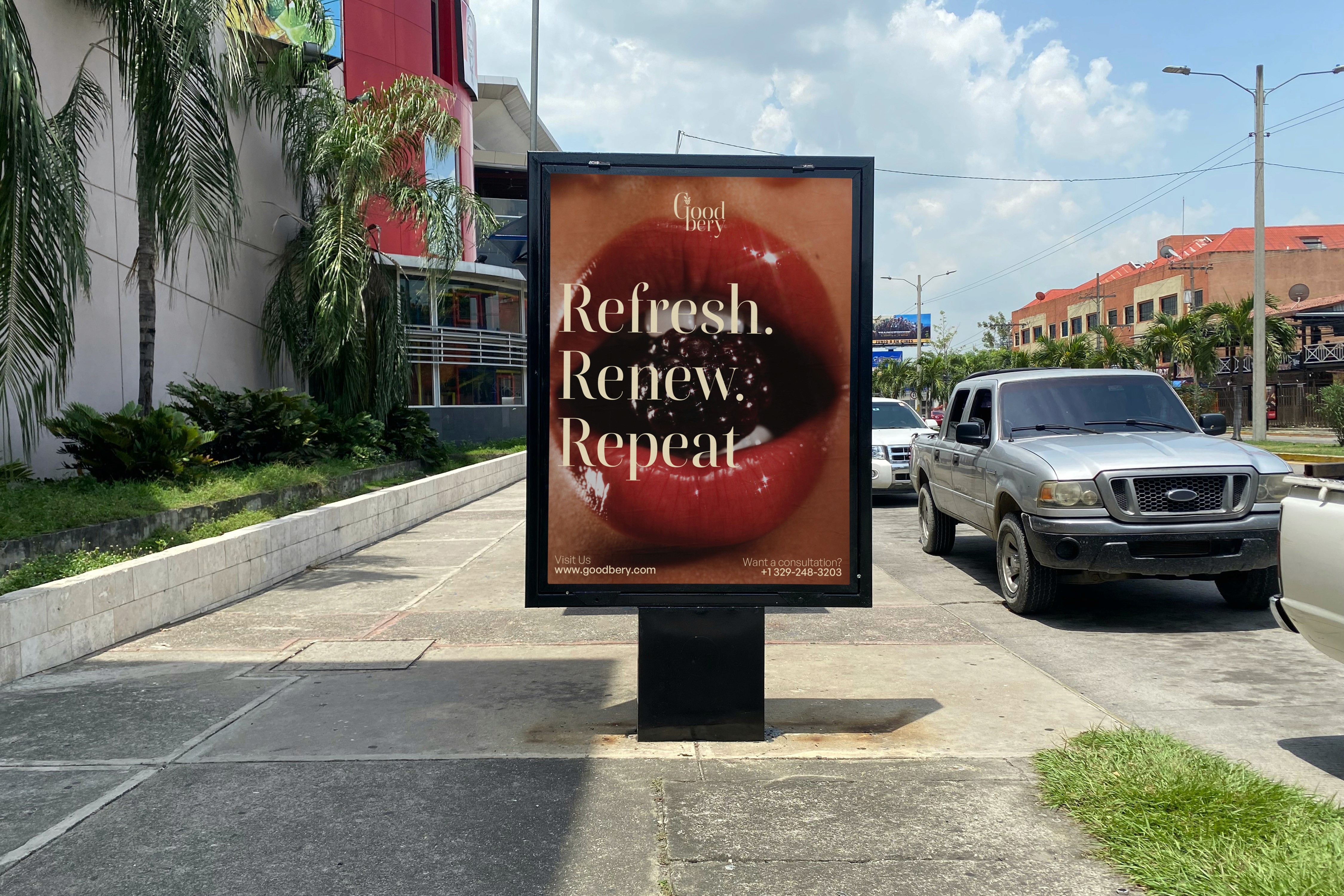
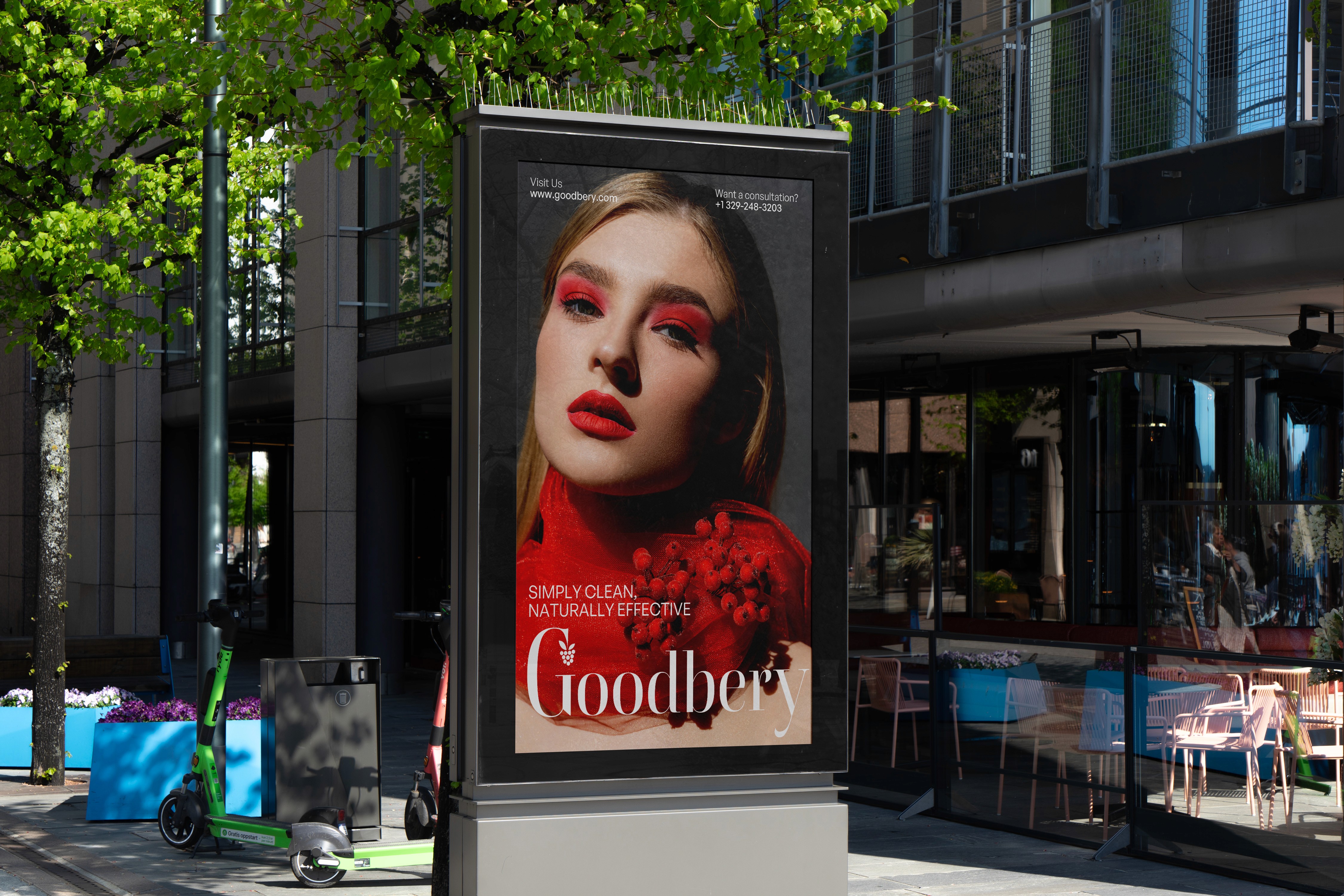
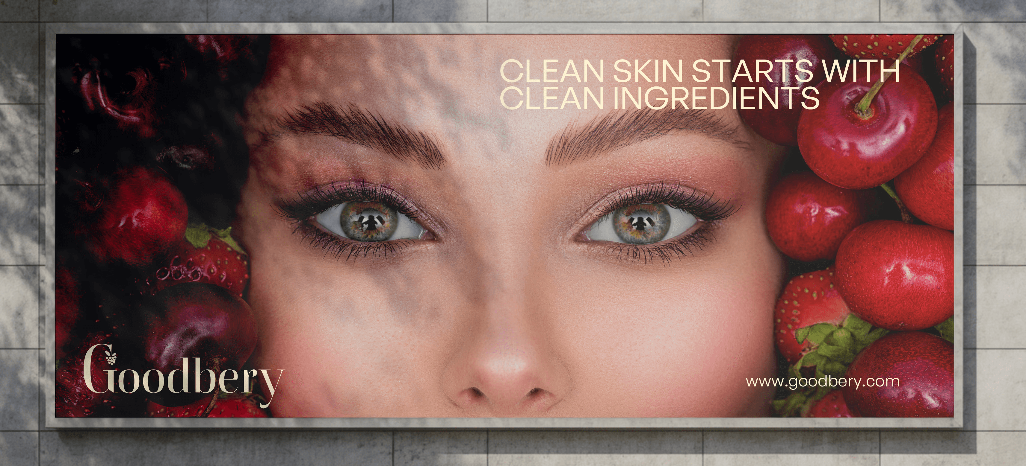
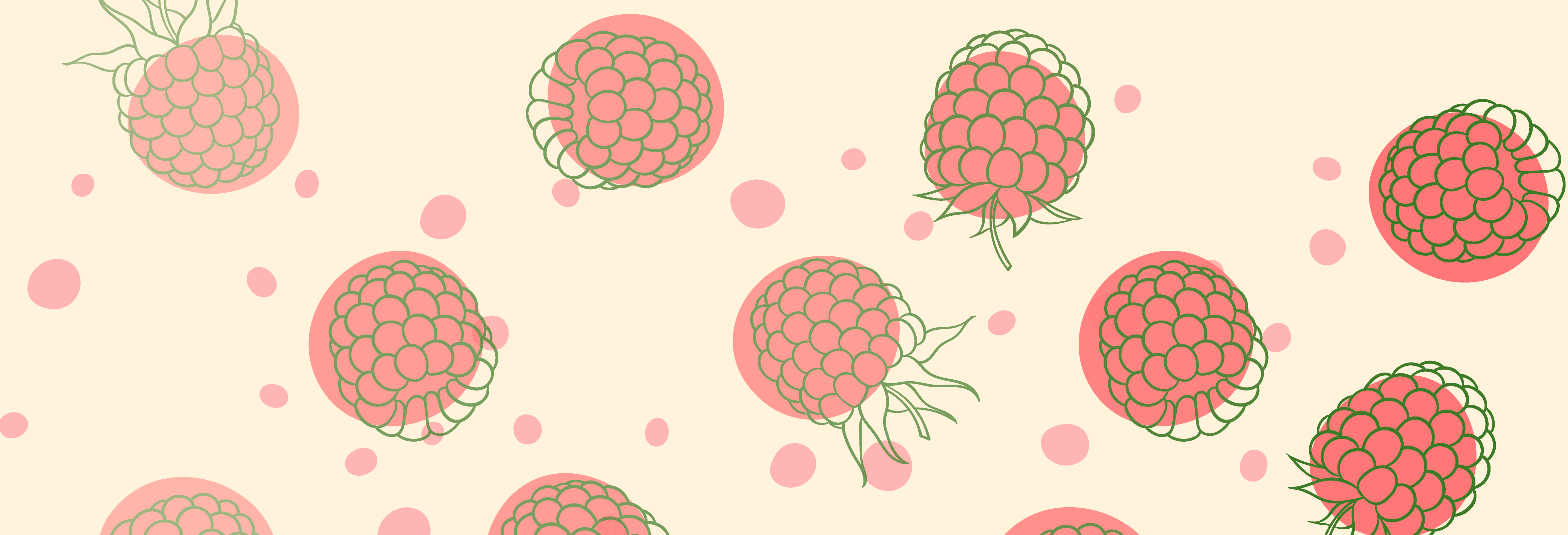
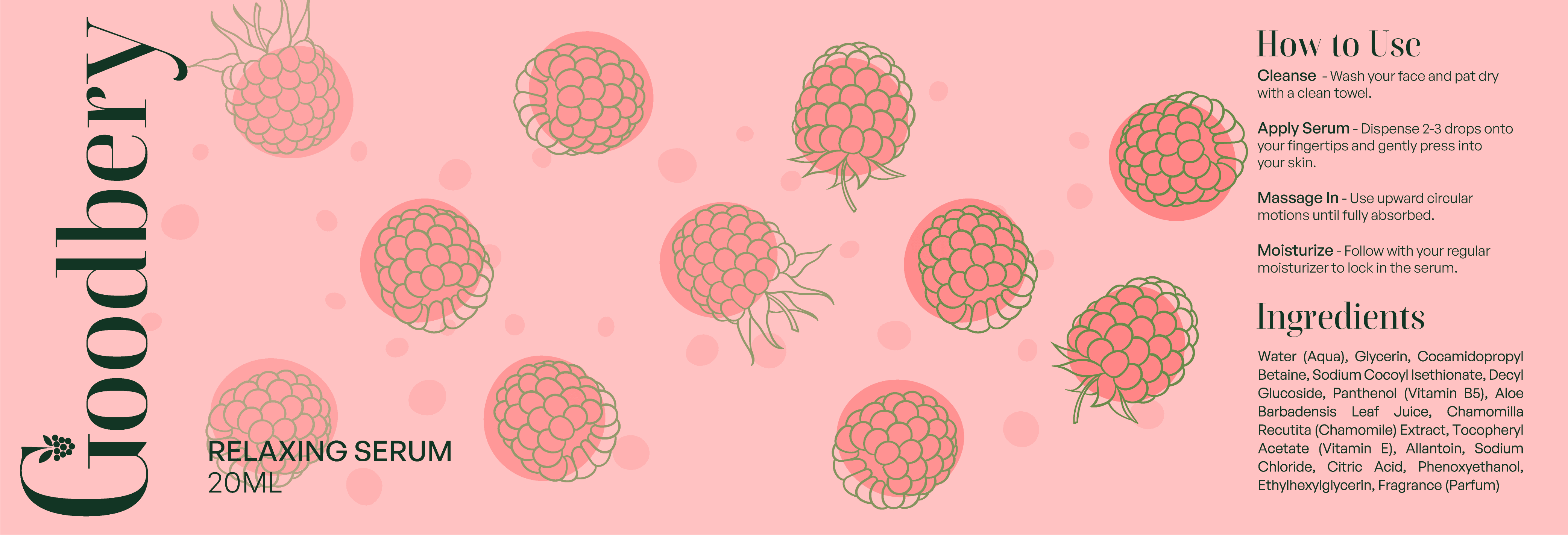
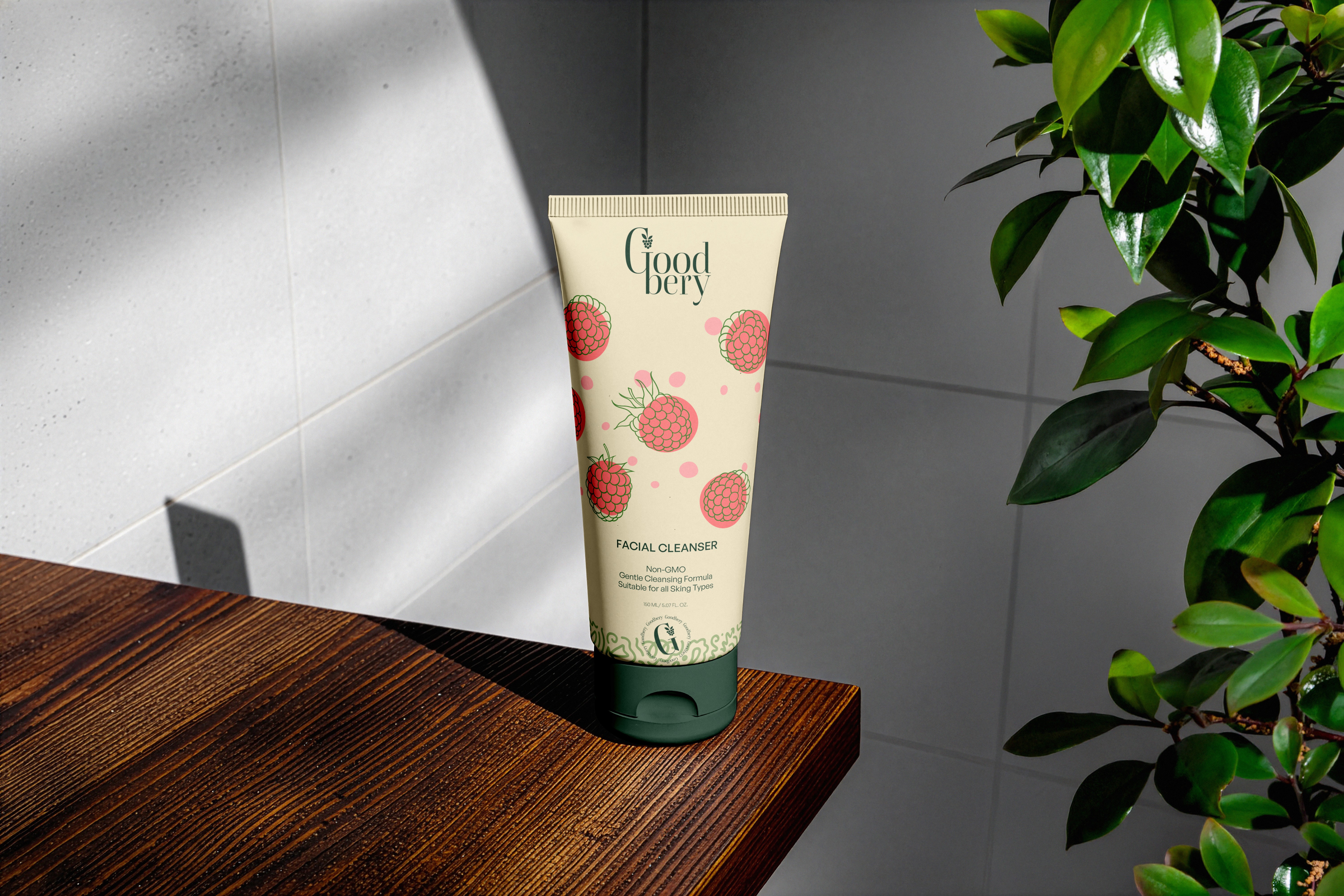
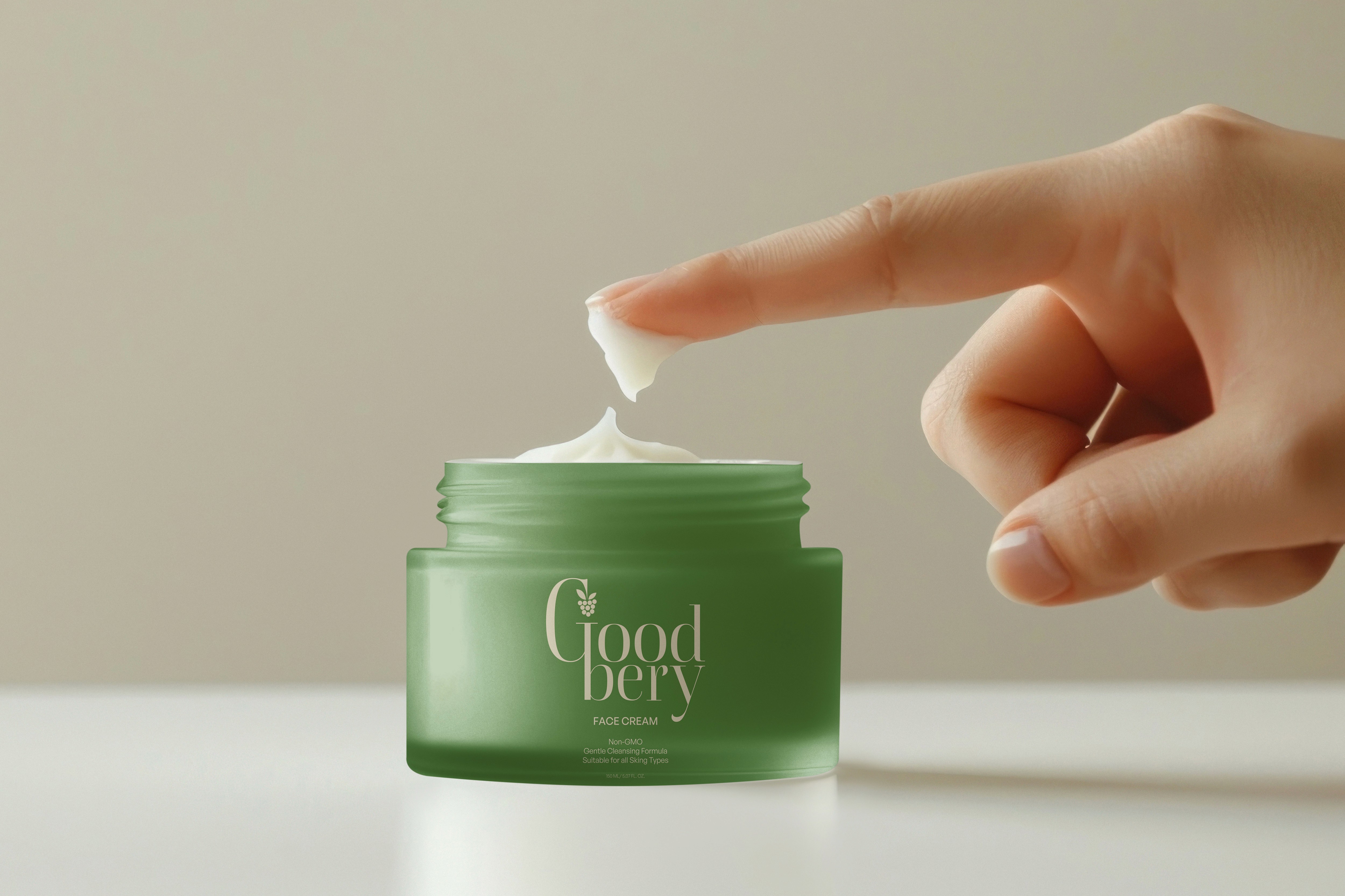
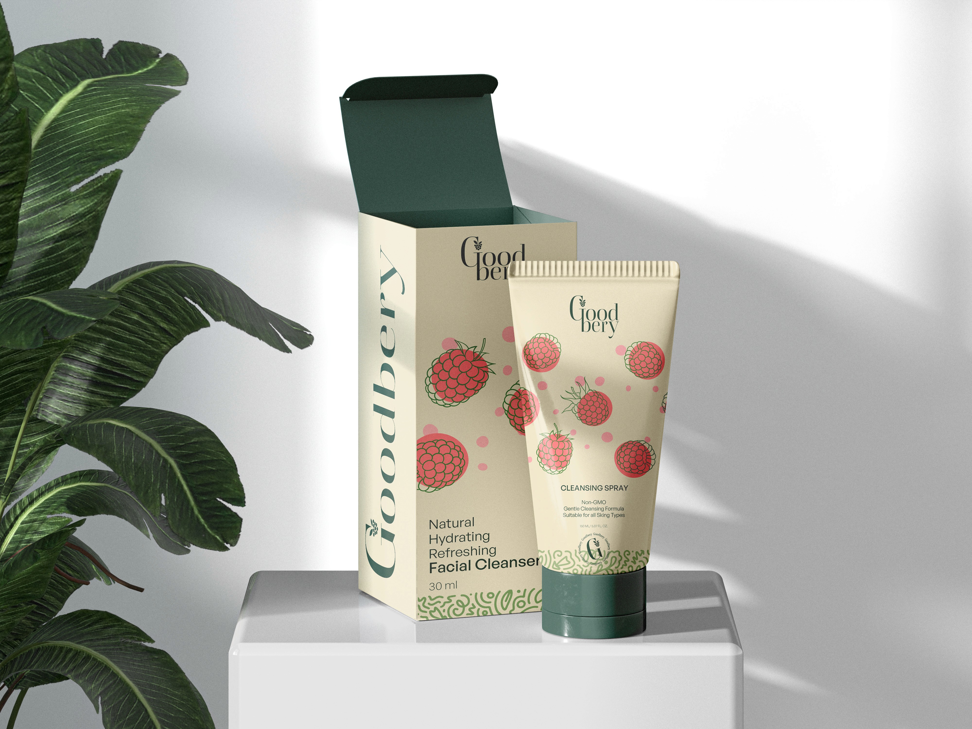
Every design choice builds consumer trust through clarity and warmth. I created a cohesive packaging system that addresses the core challenge while integrating seamlessly with existing brand assets—from the unique Goodbery berry icon (blending raspberry and strawberry hues) to clean layouts that make ingredient transparency instantly accessible.

  • Warm natural tones and approachable typography reduce purchase anxiety

  • Consistent system extends from packaging to advertisements and brand collateral

  • Clarity-focused design cuts through market noise and eliminates decision fatigue

  • Prioritizes honesty over decoration, delivering beauty that works