Photorriah

Stack of modern books and magazine with minimalist cover design on leather chair

project overview

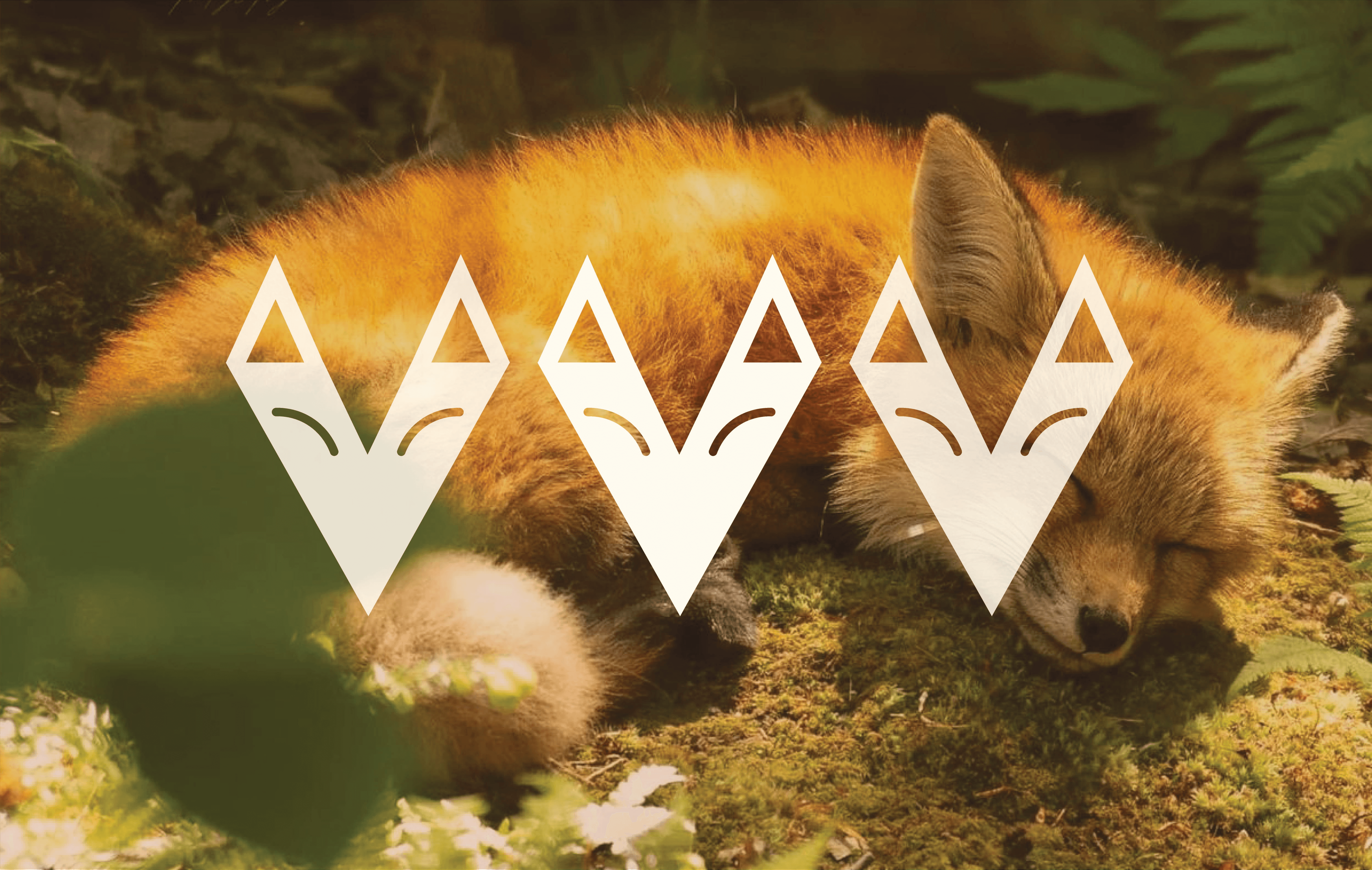
Photorriah is a Black-owned photography business specializing in authentic, artistic portrait work. Despite their talent and clear mission—capturing warmth, sunlight, and heartfelt moments—they lacked cohesive branding, making advertising difficult and hindering recognition in a competitive market. How do you create a visual identity that communicates warmth and authenticity while establishing professional credibility?

project type

brand identity

year

2025

my role

Brand Designer

client

Photorriah

Open book with sunlight and shadows highlighting editorial typography design

Who It's For & Goal

Creating a memorable brand identity for clients seeking authentic photography—families capturing milestones, individuals wanting artistic portraits, and couples documenting their stories. The constraints of the project revolved around the budget, which was lower than what was initially anticipated and key imagery that the client was adamant on including. The primary goal was attracting these ideal clients through a warm, professional system that works seamlessly across every interaction, from initial social media discovery to receiving their finished photos with:

  • Logo and visual identity system

  • Brand guidelines and style guide

  • Use case applications (social media, email, print materials)

  • Sample merchandise mockups (business cards, packaging, apparel)

Early Exploration

I explored camera-centric imagery and elegant script typography, but the first felt too literal while the second lacked Photorriah's energetic brightness. I chose a system focused around bringing the most out of Sunflower Symbolism with Organic Forms. While this was partly due to the fact that the client was adamant on sunflowers being a core theme, I found an opportunity to expound on their original concept.

I started by sampling core colors from a sunflower and building a carefully curated color palette to support it. Next I picked out an organic looking typeface that would serve as the principle headline typography for the brand, I also modified this type for use within the logo itself. Finally I found a simple and breathable typeface as the supporting body type to complete the basic feel for what the brand's messaging would look and feel like visually.

Minimalist book cover on white stairs with clean editorial design
Stack of books with modern publishing design placed on bright white stairs

Impact & System

The sunflower icon grounds the brand while feeling approachable and joyful, creating instant recognition for Photorriah. Playful organic letterforms bring energetic, genuine personality without sacrificing legibility, while sunny yellows and natural tones reflect the brand's focus on light and authentic moments. The modular system works seamlessly across every client touchpoint—from initial social discovery to photo delivery. This resulted in me providing my client with a:

  • Easy-to-use brand toolkit enabling consistent application by non-designers

  • Clear guidelines maintaining energy and professionalism across all touchpoints

  • Bright, charming elements that invite engagement and build client trust

  • Flexible system supporting business growth from digital to physical spaces


Email: jalenboyd.design@gmail.com

Based in: Washington DC

jalen Boyd

© 2026 Jalen boyd. All rights reserved

I do not use generative AI in my work

Email: jalenboyd.design@gmail.com

Based in: Washington DC

jalen Boyd

© 2026 Jalen boyd. All rights reserved

I do not use generative AI in my work

Email: jalenboyd.design@gmail.com

Based in: Washington DC

jalen Boyd

© 2026 Jalen boyd. All rights reserved

I do not use generative AI in my work